Monday, 14 December 2009
Eduardo Recife - collage
I came across some interesting work of Graphic Designer Eduardo Recife. I really liked they collage work he produces. He use old materials, stains and retro images to create the collages. It reminded me of the process I went through to create my 100 collages on A5 paper.
I collected images from magazines, books, newspaper and random packaging, cut the up and suck the down in an un organized order.
Posted by
Jade Charlton
at
04:25
Labels:
collage,
Experimentation,
Inspirations,
Research
0
comments
Sunday, 22 November 2009
Looking for pictogram poster I found manage to find and interesting one on speldwright.com. Its and interpretation of pyramid of capitalism.
I really enjoyed the look of the poster visually. I like how the bottom of the pyramid holding the rest of the pyramid. Its a clear understandable piece of work and shown me its important for the pictogram's to be clear.
Introduction 2 web designing
Dreamweaver
Here we used the software 'Dreamweaver'. Here we learnt basic parts of the software such as placeing text and makeing hyperlinks which allows to move page from page.
This is what it looks like if you view it on the internet.
Freeway
After them basic skills will used, we then viewed it as if you would on the internet. This is what it looked like.
Here we used the software 'Dreamweaver'. Here we learnt basic parts of the software such as placeing text and makeing hyperlinks which allows to move page from page.
This is what it looks like if you view it on the internet.
Freeway
Here we learnt how to use the software 'Freeway'. We learnt how to create an master page, place text and images as well as create hyperlink to jump from page to page.
After them basic skills will used, we then viewed it as if you would on the internet. This is what it looked like.
Obviously I will carry on experiment with these software so i can build my knowlegde and with the skills and understanding of the software by i will be able to make it more presentable.
Tuesday, 17 November 2009
This image is also a pictogram which is simplistic and understandable
Here is an image taken from the Chage4Life website. If you click on the image it take you to a video on the website showing activity that children can do. Aka swimming in a pool with there parent. This website shows and explains on how to get the children active and health. This has helped me relate to my target audience housewives because many housewives have children to look after and as I am aiming to get housewife more active, I thought about con binding the two together to get the housewives active.
inspiration for project.
Olympic pictogram's website
You're able to understand the meaning of the pictogram's as they're simplistic clear and informative.
Friday, 6 November 2009
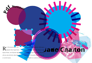
Creating a Pdf (workshop)
Front cover of my PDF.
We created this in Indesign. During this workshop you experiment with shapes, colour, strokes, size, layering, adding text and placing images.
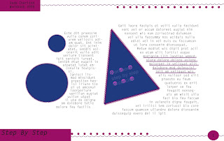
Pages in the PDF.
Carrying on from using Indesign, we created a master page that would be used on pages following the front cover. We warped text around an object and over and object after it was warped.
These workshop have given me more confindence with the Indesign software and would hopefor it to continue.
Letter press session 2,3,4
Lesson 2. This lesson we had to produce a mock up showing are final outcome. We experimented with different fonts and sizes on the print press.
This is what we hoped to produce in the fianl lesson.
-----------------------------------------------------
Lesson 3. Here we printed the word blue on 10 pages. The word blue had to be in the same positioning as seen on the mock up we produced the week before.
Monday, 2 November 2009
Computer workshop!
In an extra sign up workshop with Jo, I learnt how to integrate a photo and a hand drawn image in to illustrator.
In another session we messed around with type by changing the colour, sizing and positioning as well as messing around with are own hand drawn type.
Cropping
Dicreet
Wide angle horizontal
Bold Exciting
Crop to define
Depersonalise a photo with people in it
Crop to abstract
Narrow vertical
Close up of detail
Narrow angle vertical
Make look distant
Crop to enhance the emotional impact
Wide angle horizontal
Bold Exciting
Crop to define
Depersonalise a photo with people in it
Crop to abstract
Narrow vertical
Close up of detail
Narrow angle vertical
Subscribe to:
Posts (Atom)